Author Archives: Kate
Jane Ponsford
I love handmade paper. I’ve recently been teaching myself calligraphy and so have been dealing with lots of different paper lately as well as other textures that I’m experimenting with. Jane Ponsford – though she does work in other mediums – seems to have found her calling in paper sculptures. I’ve been pretty hooked on […]
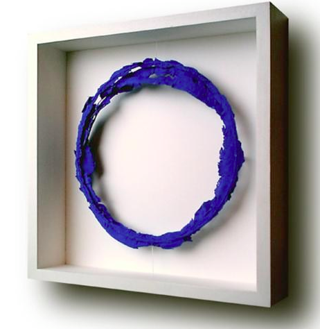
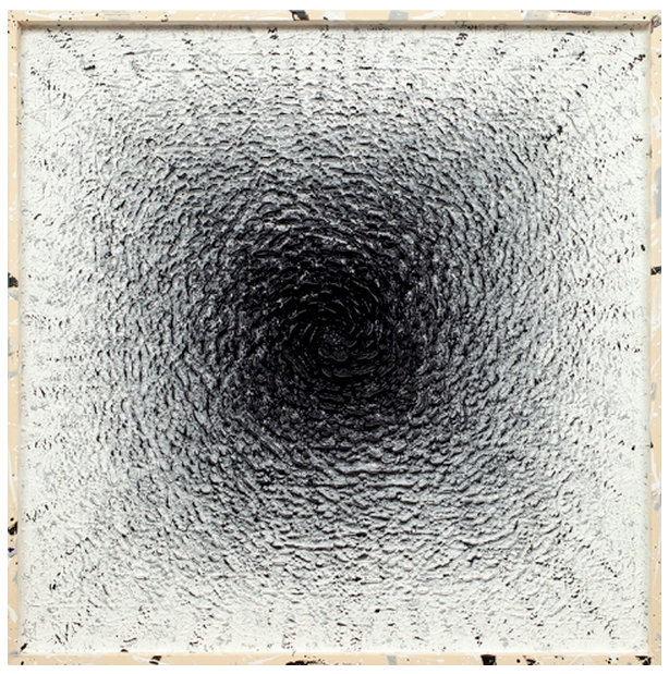
Martin Kline
We spent this weekend at my parent’s farm in NH and spent today (it’s a holiday here!) taking a class on metalsmithing / forging. It was really physical and laborious but fun. It took us hours to make a simple hook! But it once again reminded me slow processes can be the best ones. I […]
Christine Kyle
Keeping it close to home today, I came across an artist on Pinterest who I had to look up. I didn’t realize that Christine Kyle was so near to Boston when I liked her images – I just knew that the combination of egg shells and encaustic were surprising and awesome. Turns out she lives […]
Michael Wisner
I grew up in a family that loved Native American art – from basketry to pottery to large beaded works – our family room was full of these pieces on display and we regularly visited the American southwest to learn how different groups of people lived and how they created their art. It seems as […]
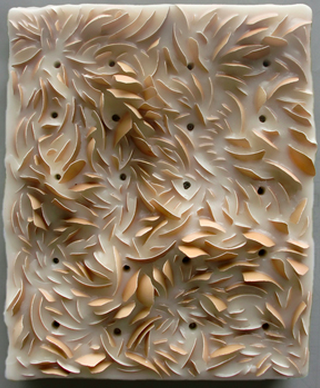
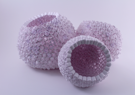
Peter Gentenaar
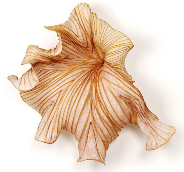
I love materials that have some translucency and those works that looks like they’ve been pulled and stretched like pizza dough. When I came across Peter Gentenaar’s paper sculptures all those loves were combined. That’s paper! And it’s also 120×140 centimeters – not small at all! Peter is amazing – he’s a former printmaker who […]
Norie Hatakeyama
As I mentioned in my last post, we recently got back from our honeymoon in Japan. We went to Tokyo, Kyoto and Osaka and loved every minute of it. It was unlike anywhere else I’ve ever been and everything from the architecture to the food to the beautiful trains even are missed now that we’re […]
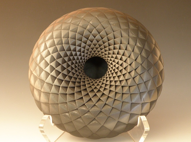
Thérèse Lebrun
A favorite medium of mine is ceramic – porcelain can be translucent, stoneware can be chalky and strong, and some can be nearly paperlike and sculptural. The work of Thérèse Lebrun is just that kind of creator though I can’t find too much about her – in English. I just love the rough edges she’s able […]
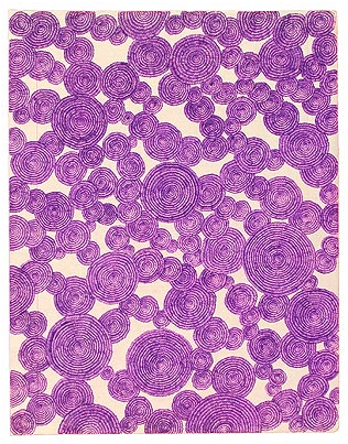
Kari Lindstrom
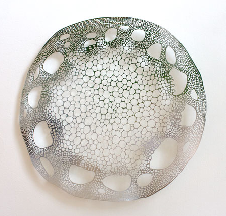
What’s not to love about microscopic, nature-inspired lasercut metal and wood veneer? That’s what I thought, nothing! I was so psyched to find the work of Kari Lindstrom – she’s a Brooklyn-based artist who makes incredible pieces showcases the crazy patterns that nature comes up with.
Shiwa Rashtian
A short post tonight because I just can’t seem to find that much information about Shiwa Rashtian online, though I do love her creations. Her design studio is located in Utrecht, Netherlands and her pieces are largely functional.
Lori Ellison
In Lori’s own words she says her interests are in, “Art that is the size and resonance of a haiku, quiet and solid as the ground beneath one’s feet.” Here here.