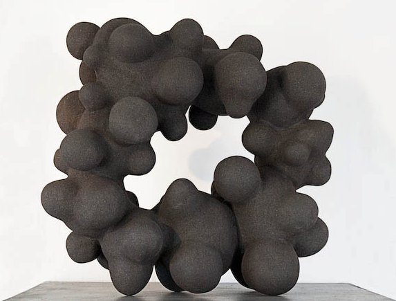
I have no recollection of how I stumbled upon Jennifer Forsberg but I’m going to assume it was through photos of her work on Pinterest. There are some incredible people curating great “boards” over there of amazing artists. Jennifer is a Swedish artist and, awesomely, her own website very clearly shows the evolution of her work and skill over time (though the appearance of polish could be a conscious choice).
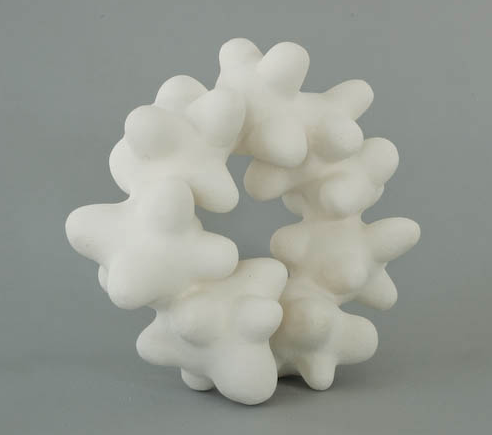
I, of course, like her work as it looks like it could be coral. The above piece is from 2006 and the site gives no detail on medium but I’m going to go with ceramic of some kind. I could be way off.
I love that much of her work is monochromatic and I also like that you can clearly see her scale also change over time (it started smaller a decade ago and some of her installations now seem quite large).
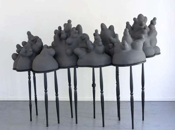
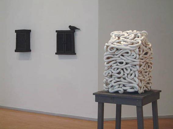
Many of her works appear on these “pedestals” of sorts – this could be to elevate the works physically but also by way of emphasis. They also appear to bring the works up to the viewer’s level, which is a unique approach to incorporate into the work itself. The above, viewed on the floor, would be quite different. It also fuses very amorphous structures with more traditional spindles, which is a neat juxtaposition.
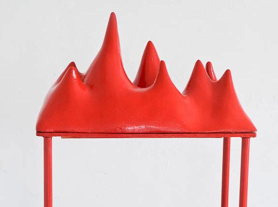
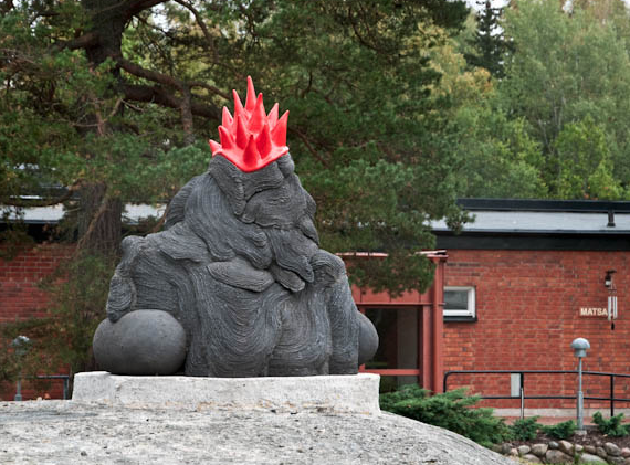
I feel like I’m looking at a punk rock Jabba the Hutt as well as a volcanic mass at the same time…
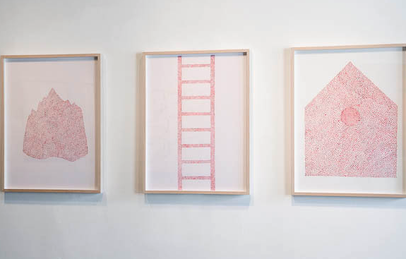
Her works are not only sculptures and installations – she has some 2D and wall hanging works. Much of her work, which I’m not showing, uses imagery of homes, paths connecting homes, coils connecting buildings, ladders, etc. I’m more drawn to her abstract works but I believe these are done by stippling, which I find cool.
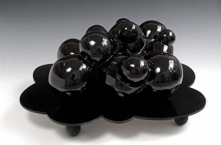
This is one of the more recent works on her site from 2011. This piece was shown in the Netherlands and to me shows more physical polish.
Coil home – had to show one!
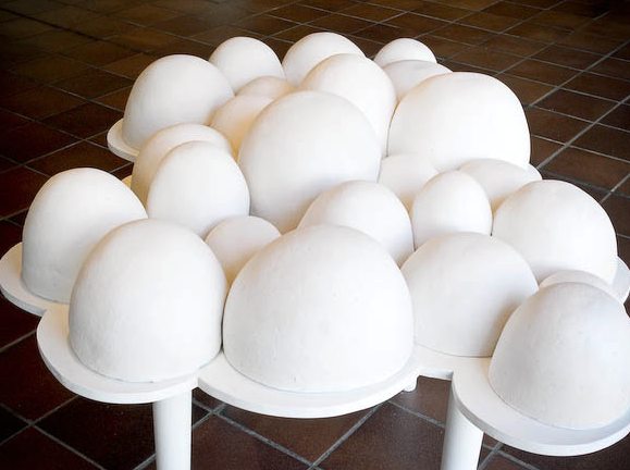
The above piece is from 2005 and is the basis for me saying the similar black one above has more polish. Not only is this literally not high shine but also even the base it’s on looks less well-done. These remind me of Louise Bourgeois.
Similar one to the first, but in black. I like the circular look too!
Tags: 2D, 3D, coral, homes, monochromatic, nature, outdoor, sculpture, Stippling
